Summary: On its 20th anniversary, this family-owned investment company felt that the firm’s old visual identity was not anymore in line with its culture and business strategy. Compared to other investment firms, Oresa opts for longer-term investments, a personalized approach and hands-on management guidance. We updated the visual identity based on the company’s new positioning, ”Partners for great businesses.” The new logotype speaks about sustainable growth on a strong foundation.
Most investment funds in Romania have very strict policies and a fixed exit-point, acquiring companies only to let them go three to five years later. So they might not be the best choice for businesses that need longer-term investments, a personalised approach, and hands-on management guidance.
Oresa is one of the oldest and most reputed investment firms in Romania. The companies in its portfolio are market leaders, partly due to its focus on growing the businesses it enters before exiting them. Its approach is consistent, flexible in terms of exit and highly customized in terms of strategy.

On its 20th anniversary, this family-owned investment fund with Swedish roots felt that its culture and business strategy were no longer represented by the company’s old visual identity.
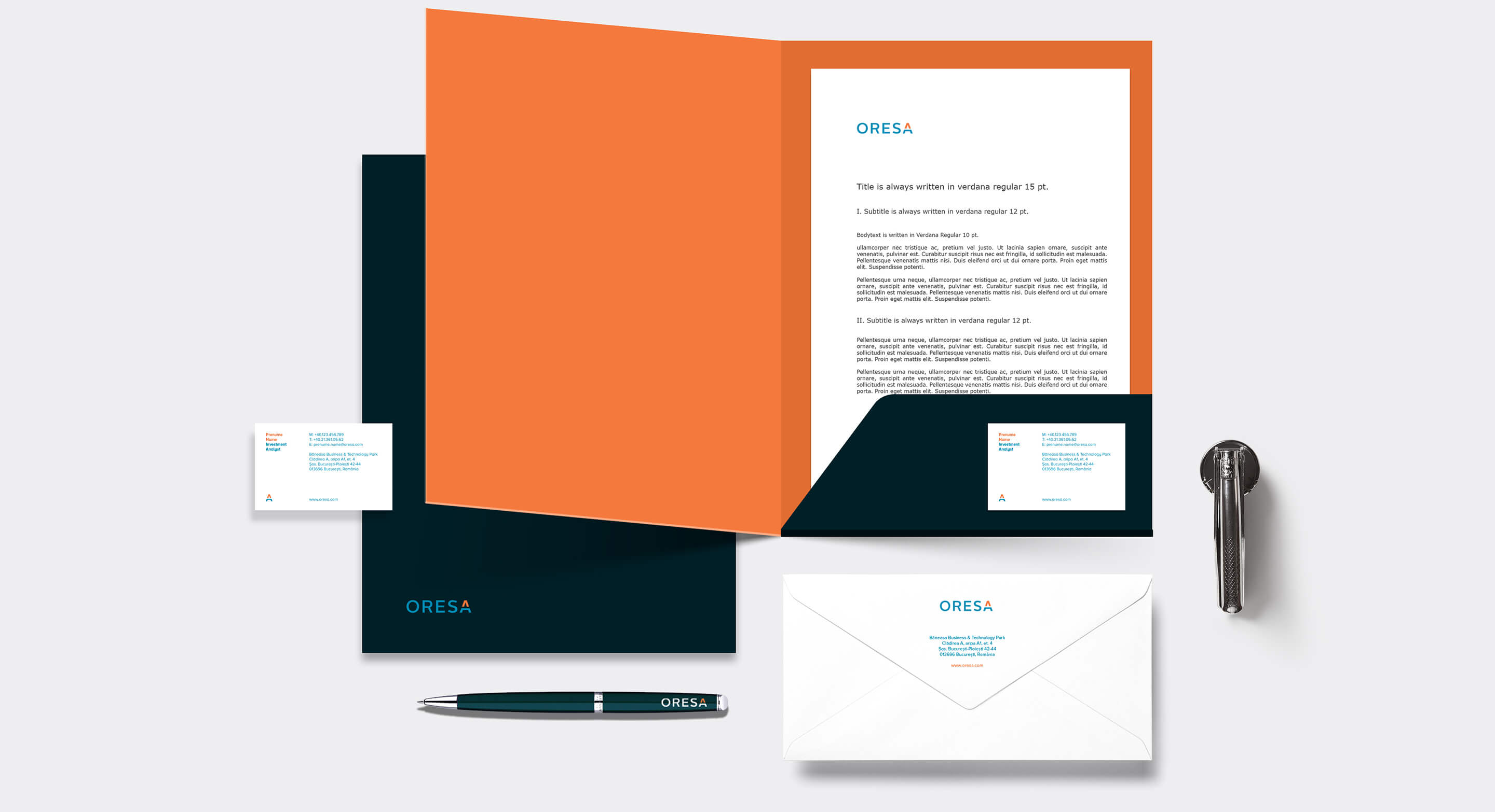
The firm has added a new generation of team members, and felt the old values did not correspond to the newly-created ethos. Being a company otherwise discreet in its communication, Oresa rightfully felt its few communication channels (the corporate website and the stationery) needed to look as professional as any other market leader brand in their portfolio.
The brand analysis we conducted among the company’s investees and business partners revealed that Oresa’s amazing track record originates in its passion for building businesses. Based on the company’s new positioning, ”Partners for great businesses,” we updated the visual identity.
From the leaders of companies like Fabryo, Somaco, RTC, RBC or Kiwi Finance we learnt that Oresa is not just about numbers, which is the approach of your typical investment company. Oresa is first about building great businesses, and their 20-year history speaks by itself with amazing exits like La Fantana or Credisson. When the passion of building something is stronger than the focus on mere numbers, there’s a story to tell, and a brand to build.
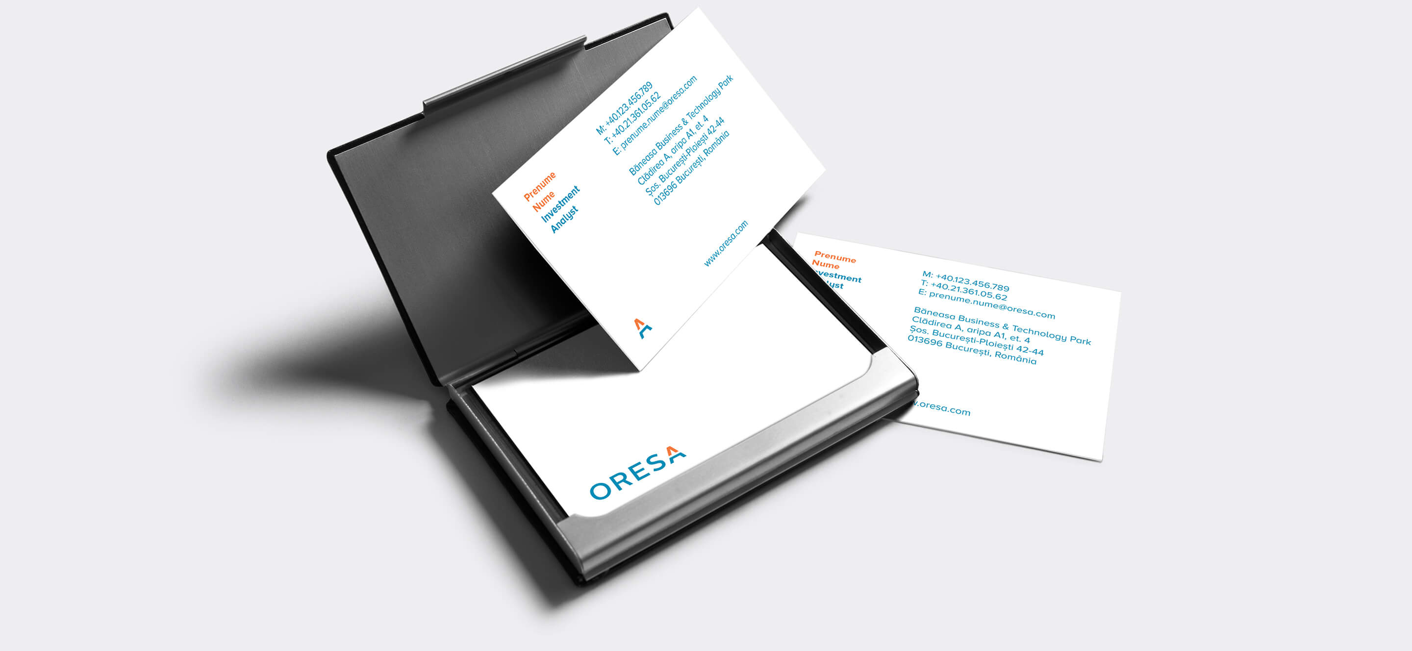
Oresa’s old logotype used the initial, longer brand name, Oresa Ventures, and included 2 stylised arrows, pointing in opposite directions. We integrated the upward arrow in the final A of the name.
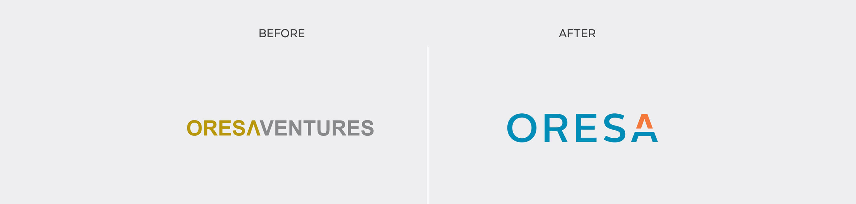
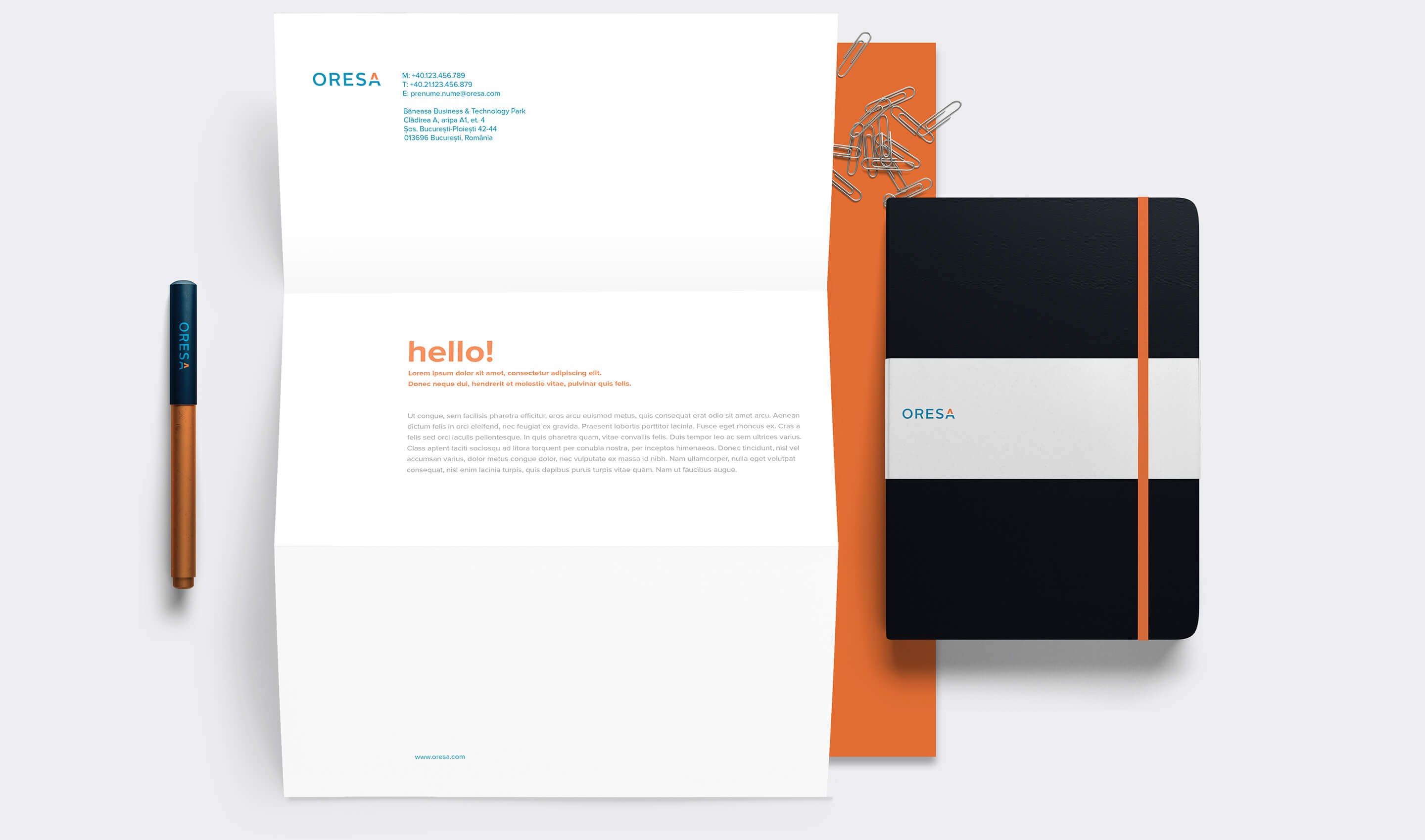
The new logotype speaks about sustainable growth on a strong foundation, and its minimalistic design complements the Swedish origin of the company.
We were impressed by the depth and the insights of Storience’s brand analysis, which formed the basis for our new brand identity and our future communication strategy. A big plus was the fact that they understood our business thoroughly, in all its detailed aspects, not only the communication part; during the process, we felt them as being part of the team.
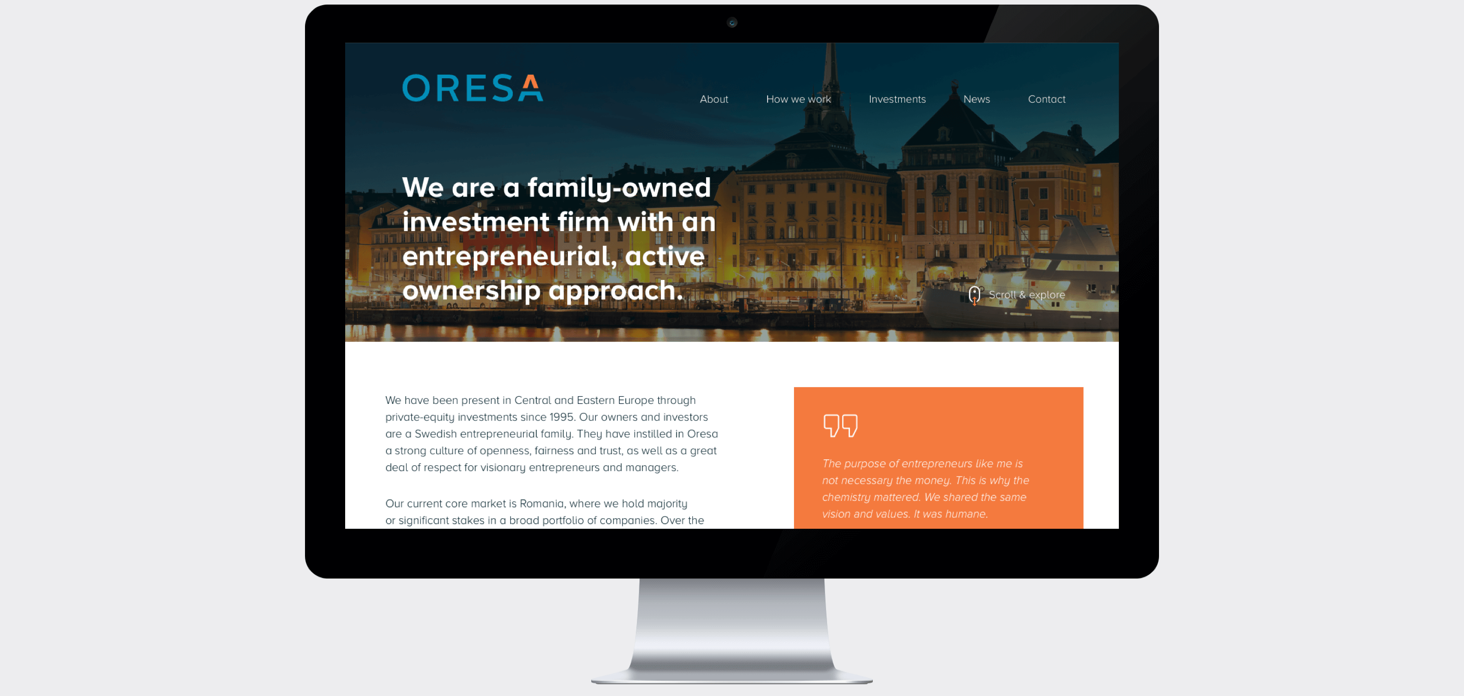
Oresa’s new responsive website includes some of the opinions recorded during the brand analysis. This way, the company no longer speaks about itself but allows the audience it targets - managers and entrepreneurs - do the talking in a genuine and persuasive manner.
Storience consultants were remarkably skilful in the research and discussions with us and our partners to understand our business and extract the substance of Oresa’s personality. They also did a great job with the design of our new logo and implementation of our refreshed visual identity. We are proud of our new website that describes our businesses, values and strategy in such a positive way.